| Audience | Marketers, lifecycle leads, and campaign analysts |
| Prerequisites | At least one running Agent |
Insights helps you measure and understand how your AI Decisioning agents perform. Explore which messages, audiences, and timing strategies drive your key outcomes and use those findings to improve results over time.
Overview
Insights is the analytics hub for AI Decisioning. It shows you not only how your agents perform, but also why, so you can make data-informed creative and scheduling decisions.

Use Insights:
- After launching an agent to track performance in real time
- During optimization to identify top-performing segments or messages
- Before making changes to content or targeting
- For reviews and reporting to measure lift and summarize learnings for stakeholders
Hightouch automatically prioritizes the most relevant charts so you can focus on the trends that matter most.
Navigate to Insights
In the Hightouch app, go to AI Decisioning > Insights
Insights views
Each view highlights a different aspect of campaign performance.
| View | Purpose | Example questions |
|---|---|---|
| Summary | Provides a top-level report of results, trends, and creative takeaways. | What themes or tones are performing best right now? |
| Recommendations | Surfaces AI-generated suggestions for improving your content mix. | What should I add, refresh, or retire next? |
| Creative Performance | Compares message-level metrics like sends, conversions, and engagement. | Which message or subject line is driving the most conversions? |
| User Breakdowns | Shows conversion performance by audience segment. | Which demographic or loyalty tier performs best? |
| Timing | Displays when users are most likely to engage, using a day/time heatmap. | What send windows generate the highest conversion rates? |
| Personalization Insights | Highlights which offers or creative types perform best for specific groups. | What incentives resonate most with younger users? |
| Personalization Matrix | Displays a heatmap of conversion rates across user segments and creative options. | Where does personalization have the most impact? |
| Send success | Shows delivery status by channel and highlights configuration gaps. | Are my channels successfully delivering messages? |
| Send comparison | Compares send volume and performance across messages, channels, or time periods. | How do sends differ across messages or time periods? |
Explore each view
1. Summary
Get an at-a-glance view of your agent’s overall performance and top insights.

The Summary includes:
- Performance highlights showing top-performing creative and audience signals
- Patterns marketers should know, based on behavior and conversion data
- Creative examples that illustrate what’s driving performance
Use this view to guide weekly reviews or summarize campaign results for your team. The Summary appears once the agent has a scheduled report.
Recommendations
The Recommendations view surfaces AI-generated suggestions for improving your content mix, based on how your messages and variants are performing. Suggestions are grouped into categories such as expanding proven winners, filling coverage gaps, refreshing fatiguing content, and retiring underperformers.
Review each recommendation and decide whether to act on it. Hightouch doesn't change your messages automatically.
2. Creative Performance
Compare all message variants side by side across your key performance metrics.

| What you might see | What it means | What to do next |
|---|---|---|
| High sends, low conversions | Overexposed audience or weak offer | Refresh content or narrow targeting |
| High clicks, low conversions | Link or landing page misalignment | QA destination or adjust CTA |
| High unsubscribes | Message fatigue or off-tone content | Pause or rewrite underperforming messages |
Sort the table by your main goal (for example, Second purchase) to identify
which creative has the strongest impact.
3. User Breakdowns
Understand which user segments are driving conversions and which are underperforming. Breakdowns include attributes like age, region, loyalty tier, and device type.
| What you might see | What it means | What to do next |
|---|---|---|
| Gen Z users underperform | Tone or visuals may not resonate | Test shorter, more visual creative |
| Loyalty users convert 2× more | Offer relevance is high | Expand similar campaigns to other tiers |
| Mobile engagement is lower | Template or UX issue | Review layout and links on mobile |
Charts are sorted automatically by AI to surface the most relevant differences first.
4. Personalization Insights
Discover which creative elements perform best for specific user segments. This view helps you understand how audience attributes and creative choices interact to drive conversions.
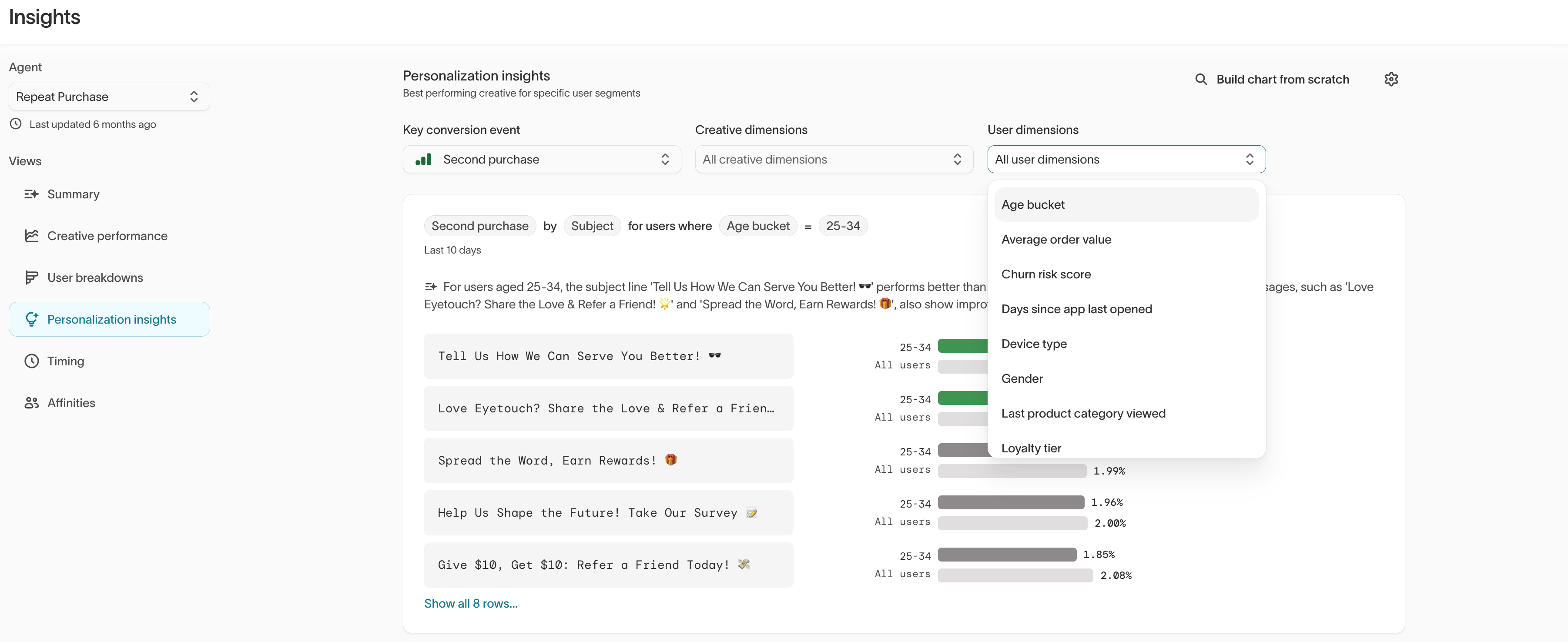
At the top of the view, select:
- An Outcome name to define what success looks like (for example,
Second purchase) - Creative dimensions to compare what performs best (such as subject lines, incentive types, or tags)
- User dimensions to compare who it performs best for (such as age buckets, loyalty tiers, or device types)
Insights are automatically sorted to surface the most meaningful performance differences for the selected configuration.
| What you might see | What it means | What to do next |
|---|---|---|
| Discounts lift users aged 18–24 | Price sensitivity | Prioritize discounts for this segment |
| Loyalty users respond to bundles | Value-driven behavior | Feature multi-product or tiered offers |
| Push outperforms SMS for high churn-risk users | Channel preference | Shift allocation toward push |
Use personalization insights to inform message tags, variant strategy, and audience splits in the Messages tab in Agents.
5. Timing
Analyze when users are most likely to convert or engage, visualized as a heatmap by day and time of day.

| What you might see | What it means | What to do next |
|---|---|---|
| Evenings convert best midweek | Post-work engagement | Shift sends later in the day |
| Weekend conversion spikes | Browsing or planning behavior | Test Saturday or Sunday reminders |
| Monday performance drops | Inbox saturation | Schedule key sends later in the week |
Use Timing results to refine Scheduling and quiet hours for your agent.
6. Personalization Matrix
The Personalization Matrix displays a heatmap of conversion rates across user segments and creative options, highlighting where personalization has the most impact.
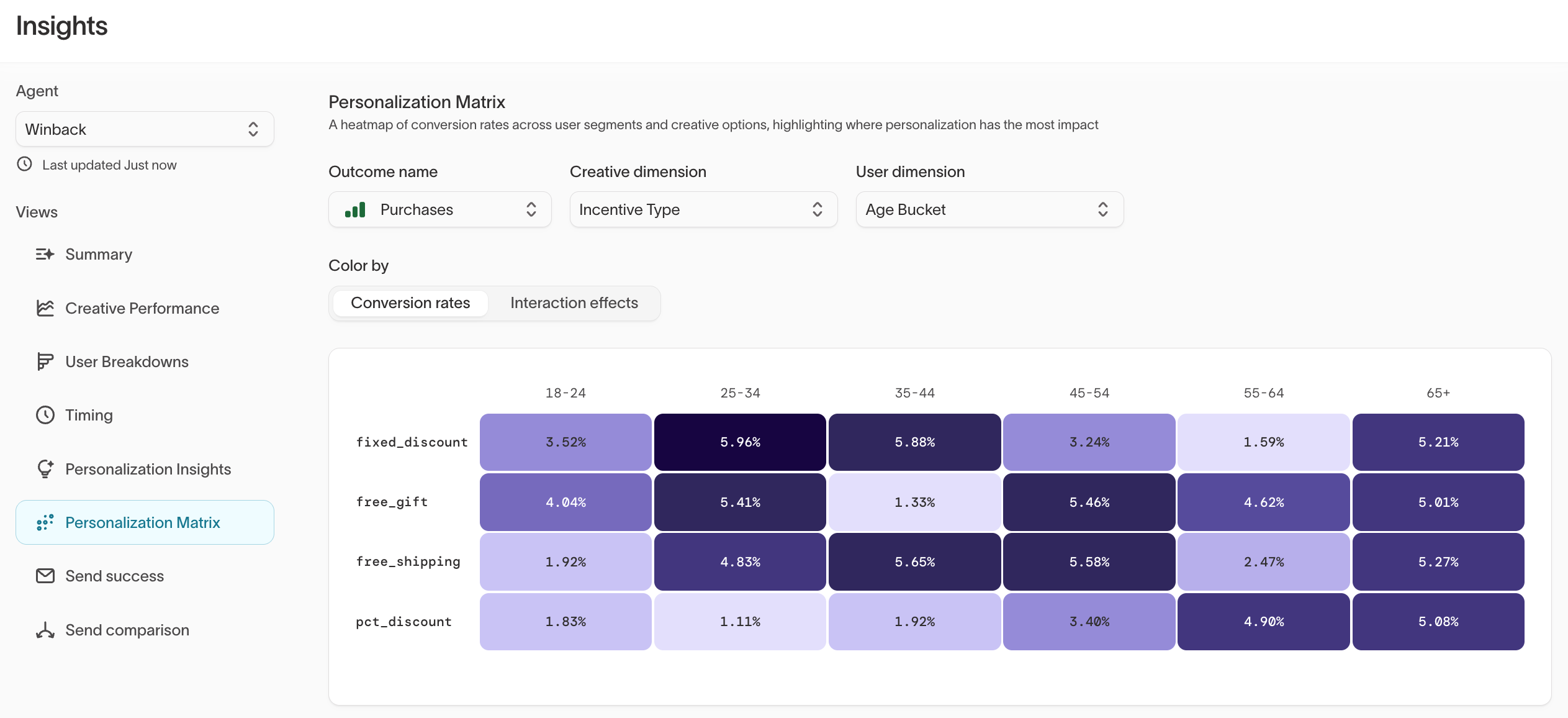
At the top of the view, select:
- Outcome name: The goal to measure (for example,
Purchases) - Creative dimension: The creative variable to compare (for example,
Incentive Type) - User dimension: The user attribute to segment by (for example,
Age Bucket)
The heatmap shows conversion rates at each intersection, colored by intensity. Toggle between Conversion rates and Interaction effects to see raw performance or the incremental impact of personalization.
| What you might see | What it means | What to do next |
|---|---|---|
fixed_discount converts 5.96% for 25–34 year olds but 1.59% for 55–64 | Strong age-based preference for discount type | Personalize incentive by age segment |
free_gift performs consistently across all age groups | Broad appeal, low personalization value | Use as a safe default when segment data is limited |
pct_discount underperforms across most segments | Weak creative option overall | Consider retiring or reworking the variant |
Use the Personalization Matrix to identify which creative-audience combinations to prioritize, and feed those insights back into your variant strategy and tags.
7. Send success
The Send success view shows whether your channels are successfully delivering messages. It displays each channel connected to the agent, its configuration status, and message-level match rates between recommendations and confirmed sends.
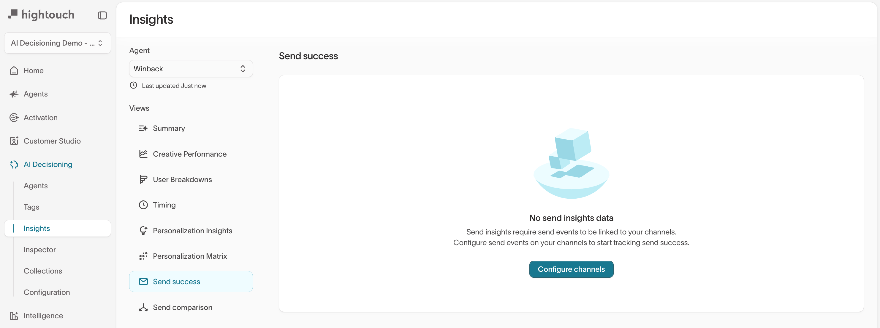
All send data on this page comes from the send event table configured in your schema. If that table is incomplete — for example, missing your AID campaigns or not kept up to date — match rates and send counts will appear lower than expected. Always verify your send event table is correctly defined before drawing conclusions from these charts.
A channel configuration card at the top of the page shows how each enabled channel is set up — its destination, send event model, and campaign ID column. If a channel is missing a send event or campaign ID column, a warning icon appears next to it. These are the most common reasons match rate looks low or attribution is incomplete.
The Match rate by message grid at the bottom of the page is interactive. You can filter by channel type, sort by value to find best- or worst-performing messages, click a message name to open it directly in Hightouch, or download a CSV for offline analysis.
Each chart on the page displays its numerator and denominator (for example, "Matched sends / Recommendations") underneath the title. Hover any data point to see the absolute counts behind the ratio.
| What you might see | What it means | What to do next |
|---|---|---|
Not configured warning on a channel | Send events are not linked to this channel | Set up send event tracking for the channel |
| Low match rate across all messages | Send event table may be incomplete or outdated | Verify the send event table includes your AID campaigns |
| Low match rate on a single message | That message's campaign ID may not be attributed correctly | Check the campaign ID column in your channel's attribution config |
Send success tracking requires send events to be linked to your channels. See Send event tracking for setup instructions. Without this, send success and send comparison data will not populate.
8. Send comparison
The Send comparison view lets you compare send patterns between treatment and customer-managed groups. Use it to confirm the experiment is shifting volume where it should and to spot channel- or timing-level differences.
Send comparison includes charts for weekly sends per user broken down by experiment group and channel type, by experiment group and campaign group (this agent, other agents, and customer managed), and heatmaps of send count by time of day and day of week. Each heatmap cell shows its share of the group's total so you can spot whether AI Decisioning is shifting send timing.
| What you might see | What it means | What to do next |
|---|---|---|
| Treatment sends more on push, less on email | AI Decisioning is reallocating channel mix | Review whether the shift aligns with your channel strategy |
| Send timing differs between groups | AI Decisioning is optimizing delivery windows | Compare with Timing insights to confirm the pattern |
| Volume is flat across experiment groups | The experiment may not be shifting behavior yet | Check that the agent has had enough time to learn and that campaign IDs are configured correctly |
Like Send success, the Send comparison view requires send events to be configured on your channels. See Send event tracking for setup instructions.
Apply insights to improve performance
Once you’ve reviewed your results, use them to guide your next optimization cycle.
| If you see... | Then... |
|---|---|
| High lift for a segment | Create a dedicated agent or audience to scale it |
| Flat or declining conversions | Revisit your goals, tags, or creative mix |
| Frequent “bad” outcomes (e.g., unsubscribes) | Adjust Smart suppression or reduce frequency |
| Specific time windows outperforming others | Update Scheduling settings to match user behavior |
Combine insights from User breakdowns, Creative performance, Timing, and the Personalization Matrix to identify your most impactful opportunities.
Example weekly optimization checklist
✔️ Review Summary for top and bottom performers
✔️ Check unsubscribe and fatigue signals in Creative performance
✔️ Compare lift vs. holdout for each goal or segment
✔️ Identify 1–2 test ideas (e.g., new variant or timing window)
✔️ Check Send success to confirm channels are delivering correctly
✔️ Review Send comparison to verify experiment groups are shifting volume as expected
✔️ Share findings with your team to inform future content and campaign planning